


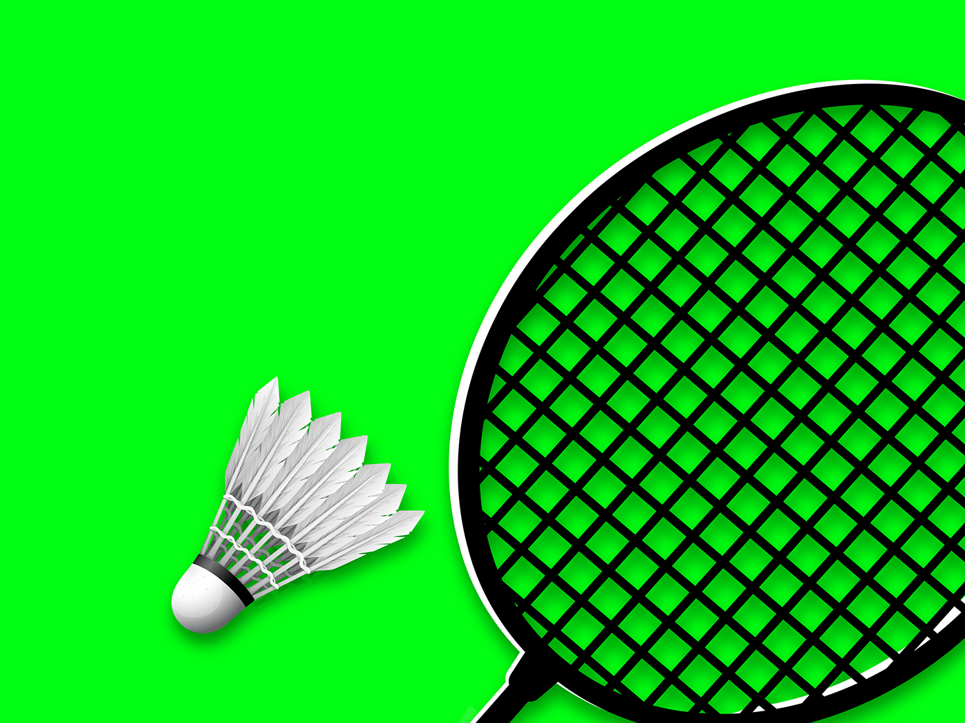
I designed this Badminton Logo for my Client. The logo showcases a combination of a racquet, shuttlecock, and a smash sign. The design captures the essence of sport with its dynamic and energetic elements which represents the academy in a playful manner. It's a visually striking representation that perfectly represents the intensity and excitement of badminton.

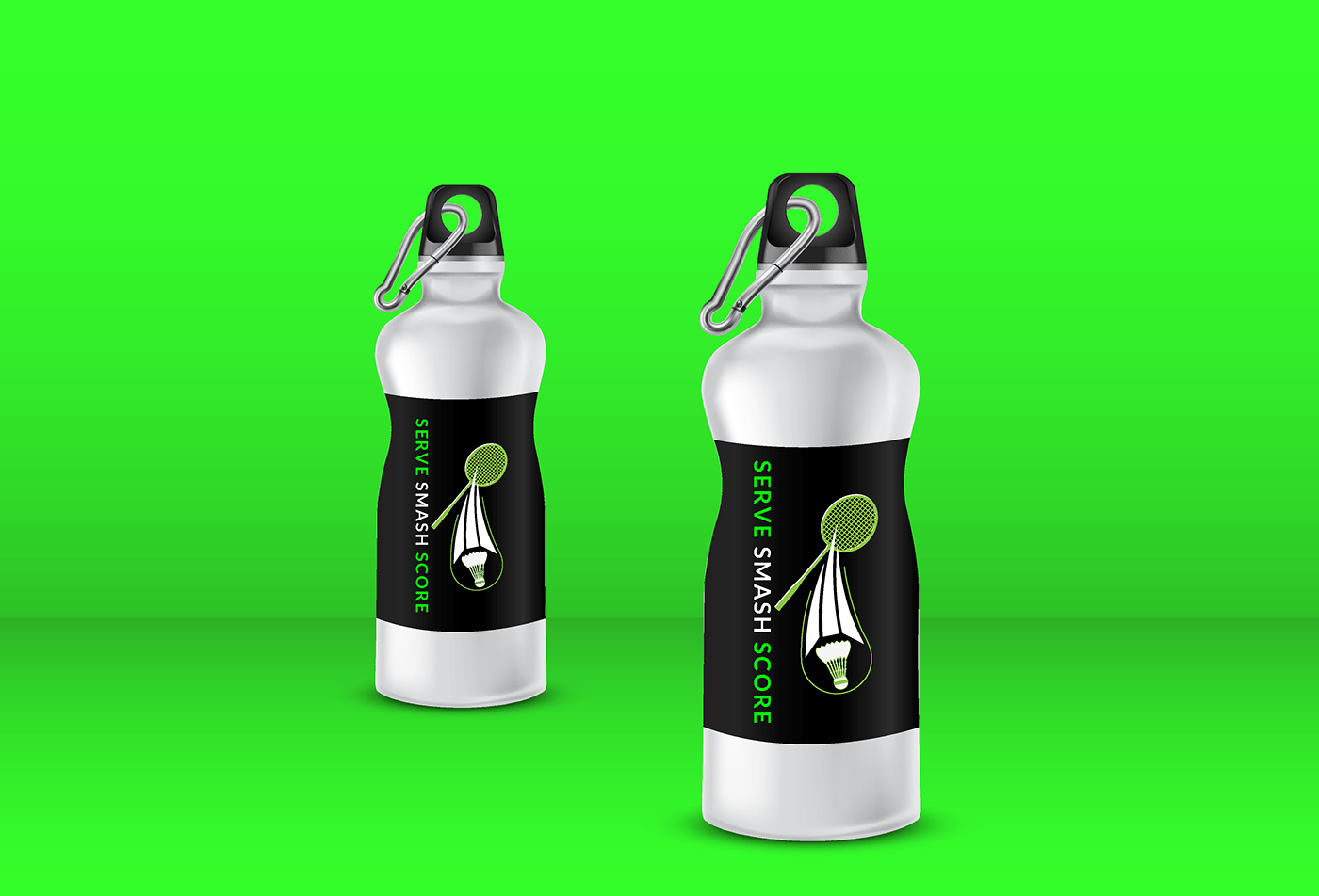
The color palette I used for this logo includes neon green, white, and a dull light green. The neon green adds a vibrant and eye-catching element, while the white provides a clean and modern touch. The dull green adds a subtle contrast and complements the overall design. In my opinion, it's a well balanced combination that enhances the visual impact of the logo, making it stand out.

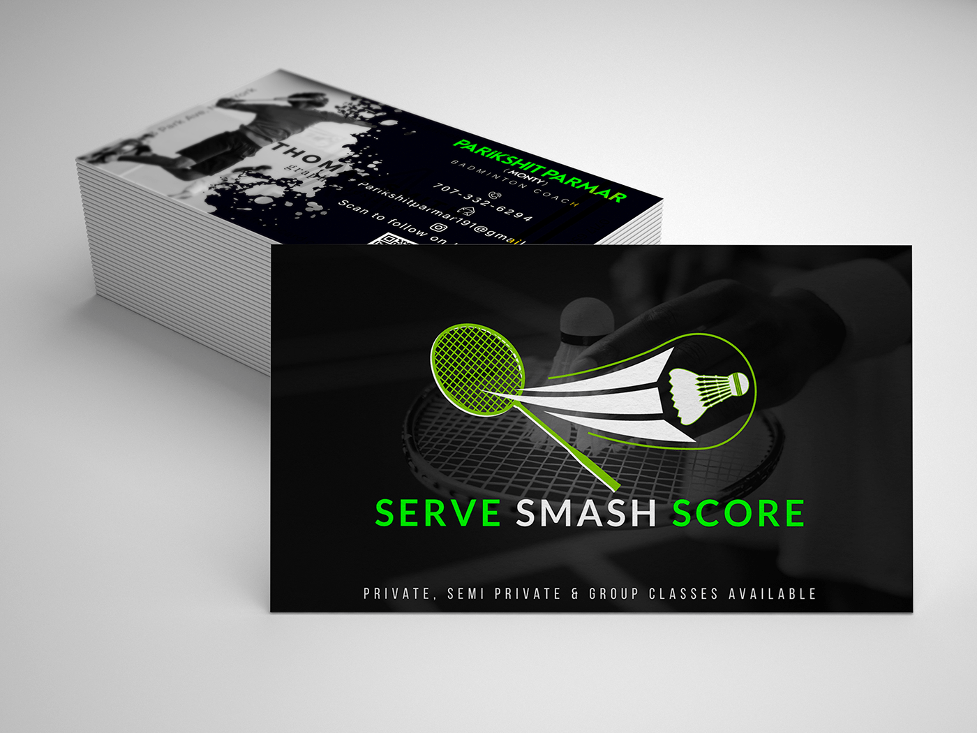
The business card I designed is a sleek design.
At the front side of the business card, the black and white background adds a touch of sophistication, while the blurry image in background creates intrigue and visual interest. The logo is kept medium in size on the front.
At the back side of the business card, where all the contact information is aligned, the image of the coach is also placed side by side which adds a personal touch and showcases the expertise of the coach. With minimal basic contact details, the design remains clean and focused.
The neon color and white color for the text makes the business card eye catchy.


I would love to hear your thoughts on the project. Please share any feedback or suggestions you have. Your opinion means alot to me.
Thank you! :)
Thank you! :)


